
This Pride magazine is symmetrical because the text is on either side, this then makes the model stand out and the image is then symmetrical. Her face is fixed in one position so that one side will not look different and that her face is completely symmetrical with only the text around her being different. I could argue this is radial symmetrical because the story is around her face and isnt over lapping.
Asymmetrical (informal balance)

The Rollingstone magazine is asymmetrical because the text is only on one side and Wiz Khalifas face is different, this makes the magazine informal. The designer made the face bigger and part of the text over lap his head, the magazine can only be symmetrical if there is text on the other side and his face was straight.
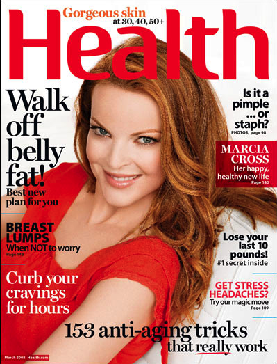 Asymmetrical balance by shape
This magazine is asymmetrical by shape because her body is at an angle and the her posture isnt straight so the picture will not be symmetrical.
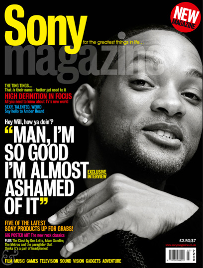 Asymmetrical by position
In the sony magazine Will Smiths position is to the right this makes it asymmetrical by position because there is no line of symmetry. The image could be symmetrical but Will Smith's hand makes this Asymmetrical by position

Asymmetrical by texture
The image of Niki Minaj is Asymmetrical by texture because her leather dress is very detailed with shiny reflections and a detailed pattern on her belt. The textures on her face also catch's a reflection, Overall this makes Niki Minaj stand out
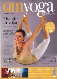
 Asymmetrical by eye direction
This omyoga magazine is asymmetrical by eye direction because the women is looking at something but not the camera, this is showing that her yoga move needs concentration and not even a professional can do it without concentration. Its also asymmetrical by shape because her body position is pointing upwards and she has a curved body.
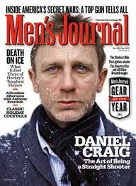
Radial by balance
This is radial by balance because the text around Daniel Craig in a circle shape, this makes it Radial also the text isnt going over all of his face.
Asymmetrical (informal balance)
The Rollingstone magazine is asymmetrical because the text is only on one side and Wiz Khalifas face is different, this makes the magazine informal. The designer made the face bigger and part of the text over lap his head, the magazine can only be symmetrical if there is text on the other side and his face was straight.
Asymmetrical balance by shapeThis magazine is asymmetrical by shape because her body is at an angle and the her posture isnt straight so the picture will not be symmetrical.
Asymmetrical by positionIn the sony magazine Will Smiths position is to the right this makes it asymmetrical by position because there is no line of symmetry. The image could be symmetrical but Will Smith's hand makes this Asymmetrical by position
Asymmetrical by texture
The image of Niki Minaj is Asymmetrical by texture because her leather dress is very detailed with shiny reflections and a detailed pattern on her belt. The textures on her face also catch's a reflection, Overall this makes Niki Minaj stand out
Asymmetrical by eye directionThis omyoga magazine is asymmetrical by eye direction because the women is looking at something but not the camera, this is showing that her yoga move needs concentration and not even a professional can do it without concentration. Its also asymmetrical by shape because her body position is pointing upwards and she has a curved body.
Radial by balance
This is radial by balance because the text around Daniel Craig in a circle shape, this makes it Radial also the text isnt going over all of his face.
GREEN
Really good piece of work with the right amount of detail and analysis. Well Done.
No comments:
Post a Comment